Originally posted January 26, 2023. An early noise-painting walkthrough.
The starting composition
Alrighty, so let's do some noise painting! I started with this, and turned it into this with Clip Studio. That's our starting point. I have no idea what I'm going to make or what the final piece is going to look like, even what I'm going to prompt in. So let's do this shit
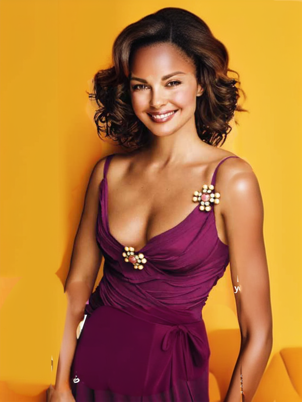
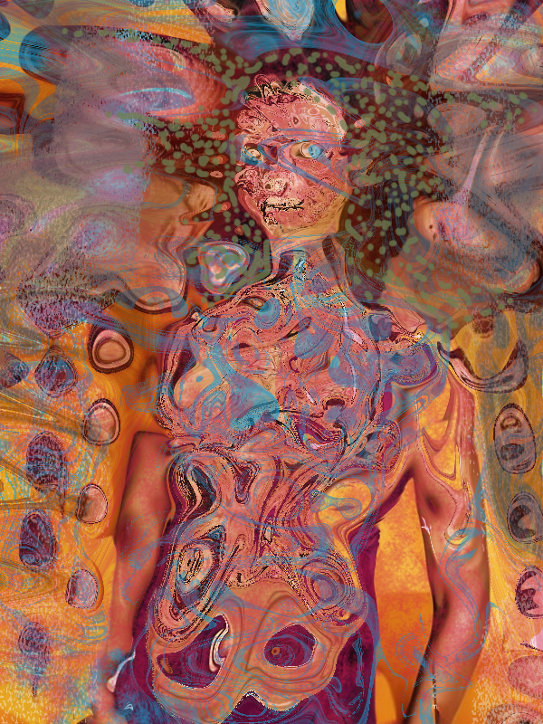
Checking the depth targets
The first thing I do is run SD 1.5 Pruned on a very low setting with a generic setting to see if my depth targets look more or less right over however many images. If SD can't figure out a face or a bust, we're in trouble. Basically we just want everything intact
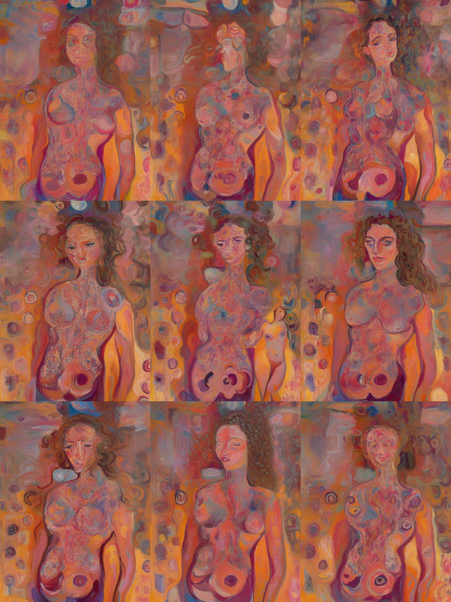
For a next step, I keep the prompt and the image as is, and I'm going to run it through a checkpoint that does really well at line art. My recommendation here is something like Pulp Art Diffusion, which incidentally is based on public domain work, so it's extra good
As you can see, we've already broken the pulpy art style completely, and confused the holy heck out of the computer. Remember trained models only give a predictable style when you give them boring predictable data. Fuck with the noise or lines or color, and watch it get weird!
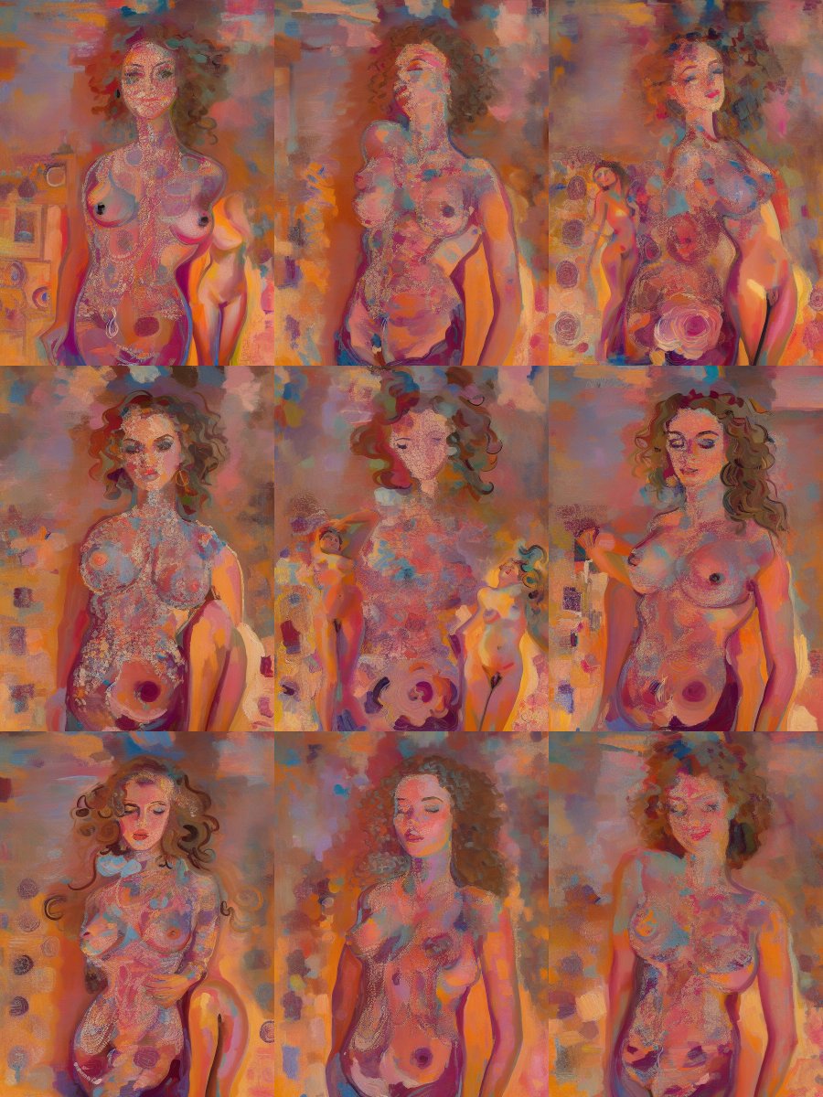
So now, on the overtrained checkpoint, we begin to see a problem if we turn the noise settings any higher than basic line correction. What's happening is that while our facial and body targets are about right, our depth targets are not, and we're getting undesirable results
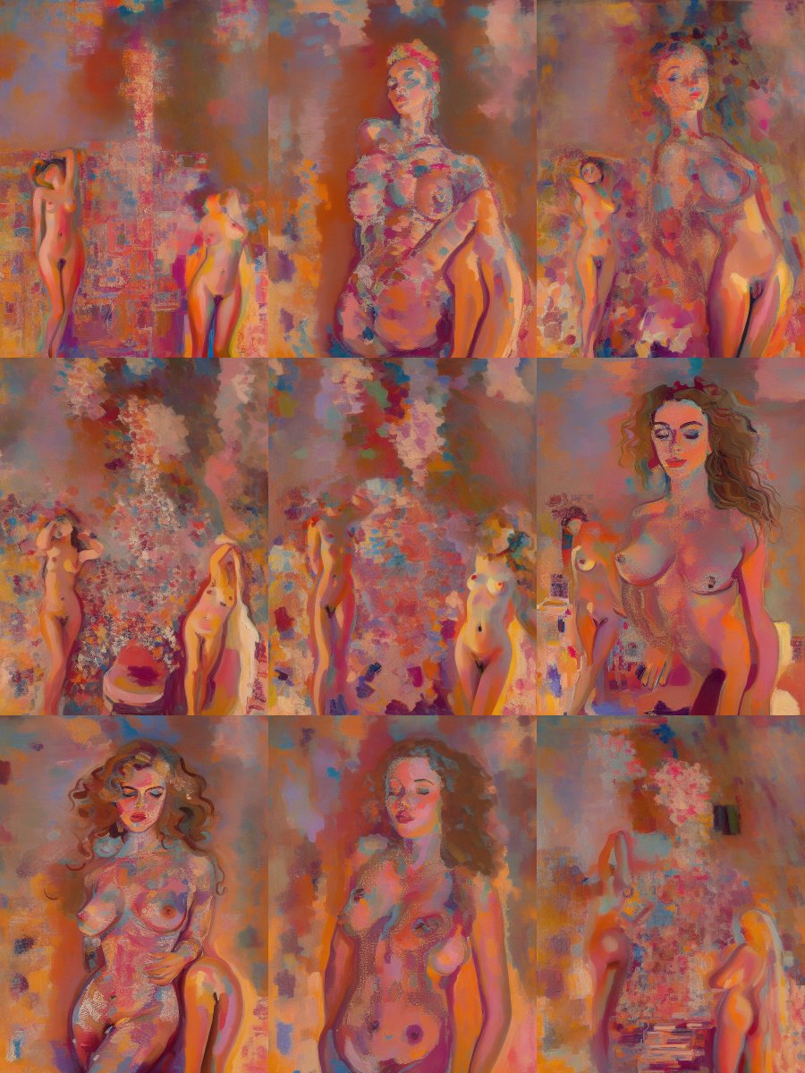
A simple layer of semi-transparent black separates your foreground from your background, and now, instead of six images out of nine being messed up in some way, eight out of nine are perfectly fine. Them's some good odds.
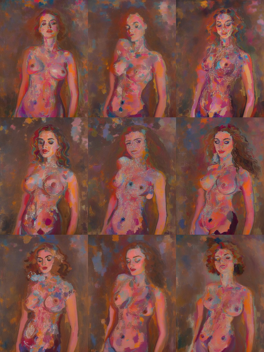
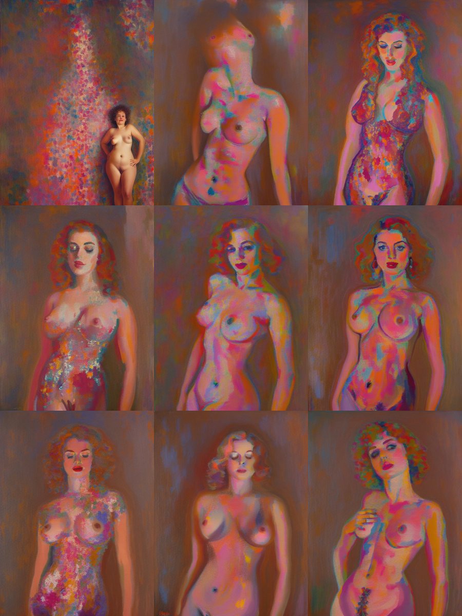
Turning it up to .47 yields 2/3rds usable results. And in the old days, circa October 2022 (about 900 paintings ago), I would have stopped somewhere around here. Called it good, posted a pic to twitter, and let people tell me how pretty it was. That's the basics of noisepainting
Compositing more noise
So occasionally, the system will spit out something beautiful and expressive that I don't really have a use for at the time. I save these for compositing. See, once we've established our noise paint is functional, that's where the real fun starts!
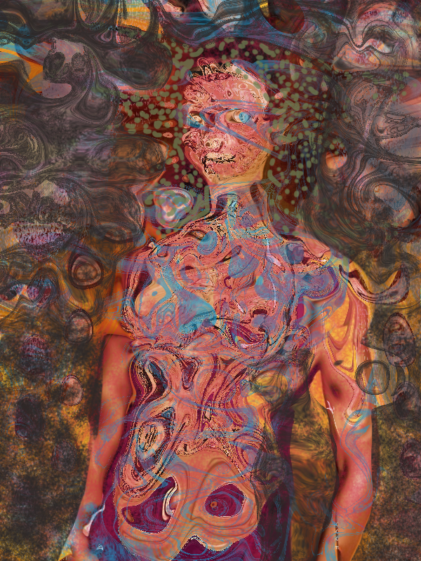
A little compositing, a little warping, and now what we have is an even noisier background, and some pretty nice color noise for her clothes and hair (I always start with nudes, by the way, it's just easier)
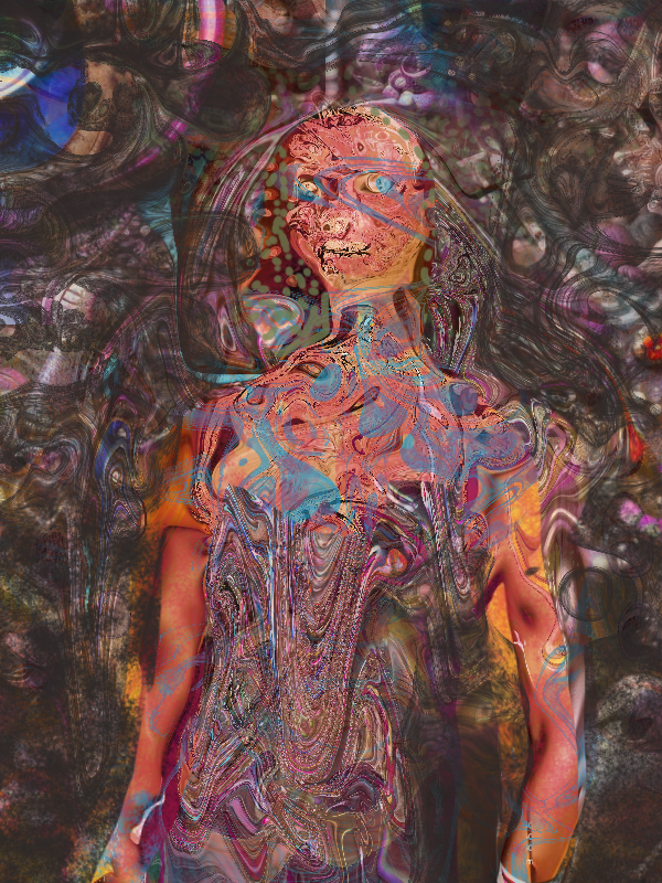
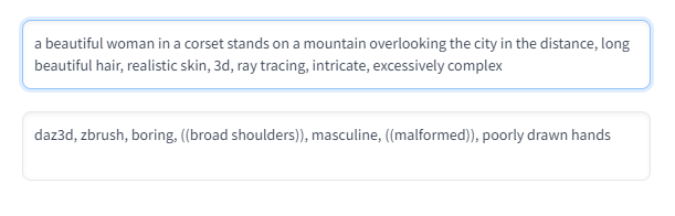
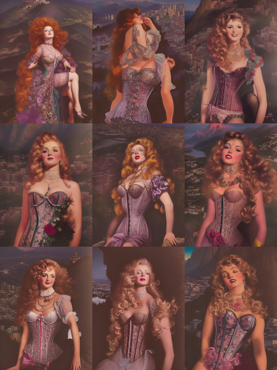
Then I prompt this into Stable Diffusion, and it comes to life, giving us some nice looking (boring) gothic art. Remember, noise painting breaks the system, and broken isn't bad. But we do get a lot of nice texture. Now, we're about ready to go crazy. Ready?
Funnelling in chaos
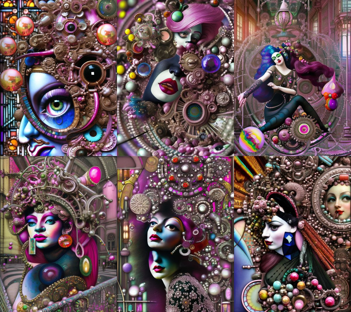
Now, we switch to the checkpoint we're going to use. As you can see, the first render with the simple query is still generating some painfully boring art. That's why we're going to funnel in some chaos and make something interesting
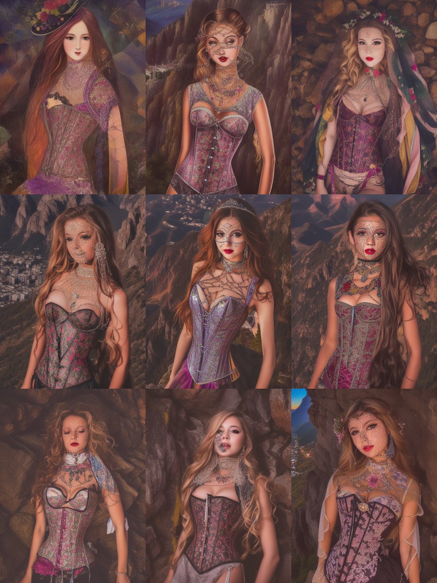
Fun fact: If you overflow a stylized checkpoint, ANY stylized checkpoint, but especially the ones with style switches turned on, you can usually get a much more flexible version of the style that isn't as dramatically over trained
It doesn't take much to get this to start working for you either. Here, I'm funnelling in Hannah Höch and Gil Elvgren, both the versions from the 1.5 model. And I'm telling it to use Dada movement, and Surrealism as guidelines. This is basic, but it gets us there
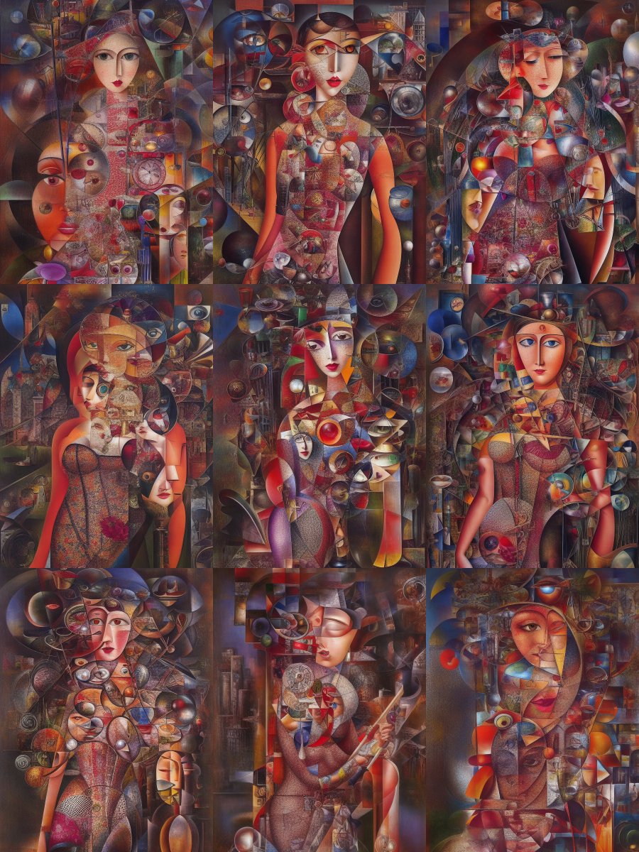
So thoughts:
1. I don't like working in flat realism because it's boring... unless you've got some kind of extremely interesting angle on it going on. There are artists that can do it well. There aren't many who can or should. Your mileage may vary
2. Gil Elvgren was a pop artist who did not do abstract. However, Hannah, a radical German collage artist, did use his work, and the work of similar artists, in her collages. Without Gil or an artist like him, it's difficult to recreate the language of it with an ai. Ai's have knowledge gaps
3. If you're planning on naming a category or a time period, you'll get better results if you study it. Keep art books and websites about art history at the ready. You'll need them. They're useful and inspiring. If you name an artist by name, know the expressive language
On that third point, it's important because you can't subvert or recontextualize an artistic language well, if you don't get it. You'll always be able to use it. But knowledge is the difference between a scalpel and a sledgehammer. I mean, sometimes you do need a sledgehammer tho
And now, we go nuts, do automatic writing, let your fingers do the walking and leave your critical mind at home, compare ideas, go exploring, and most importantly, turn your noise reduction levels high enough to almost destroy your noise painting 40% of the time at 0.6
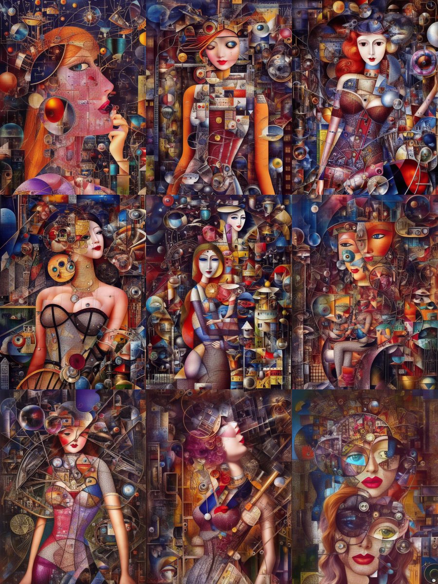
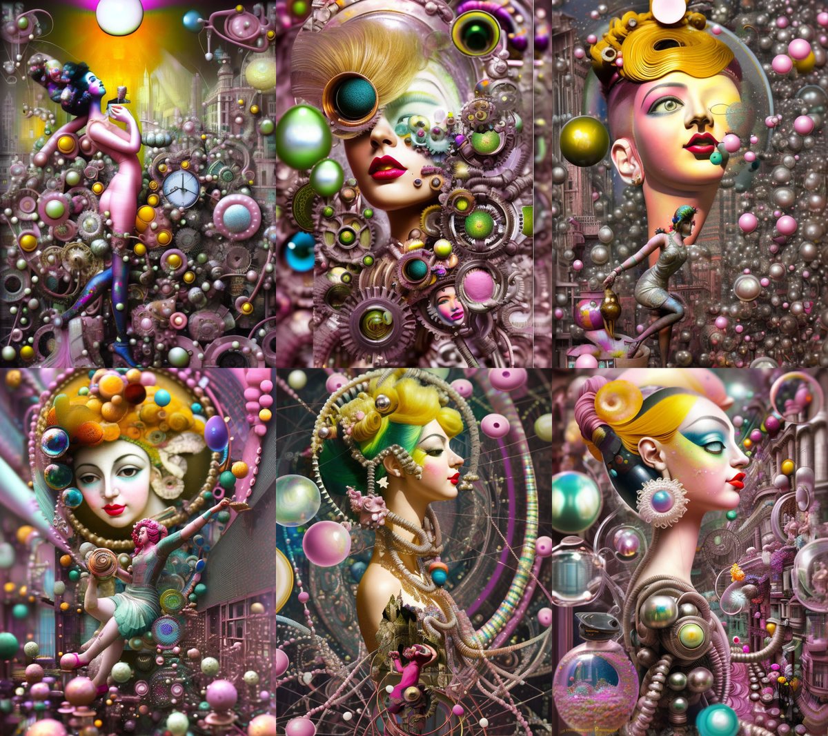
I dunno, should we go just a little crazier with it? We've come this far. Okay, fine, you talked me into it. But first we need to refine our prompt a little, and add some emphasis tagging. There, this is a little better
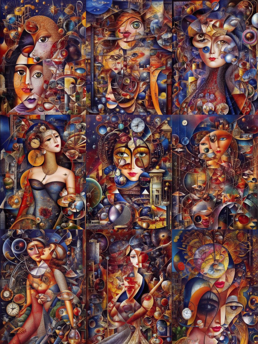
And up to 7.4...
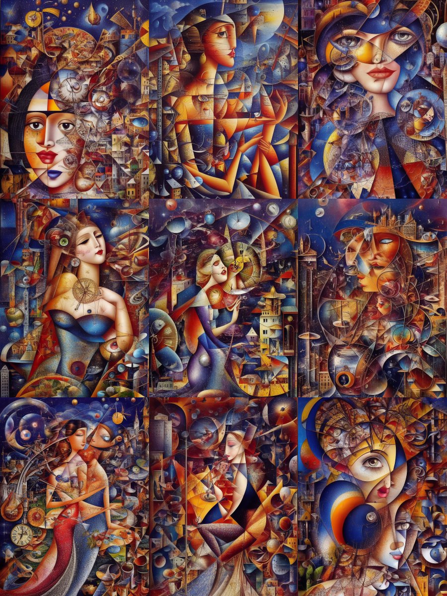
Switching to Inkpunk
Since I didn't really have a goal here tonight, I didn't really have a destination. But say, theoretically, I did, and these weren't getting me there. Like say that this bright shiny happy art wasn't what I wanted to make? Well, friends, have no fear. I have inkpunk for broody
Using it the same way with the same top-loaded, overloaded prompt and our same seed. If anyone's interested, my seed value is 165678995. But, since this experiment does have to end, let's get it to where it blocks like the original
These are gorgeous, but they're way too clean. This breaks the funnelling completely. 7.4 is too high. Going to have to turn it down. Thinking... let's go down to 6 and see what happens
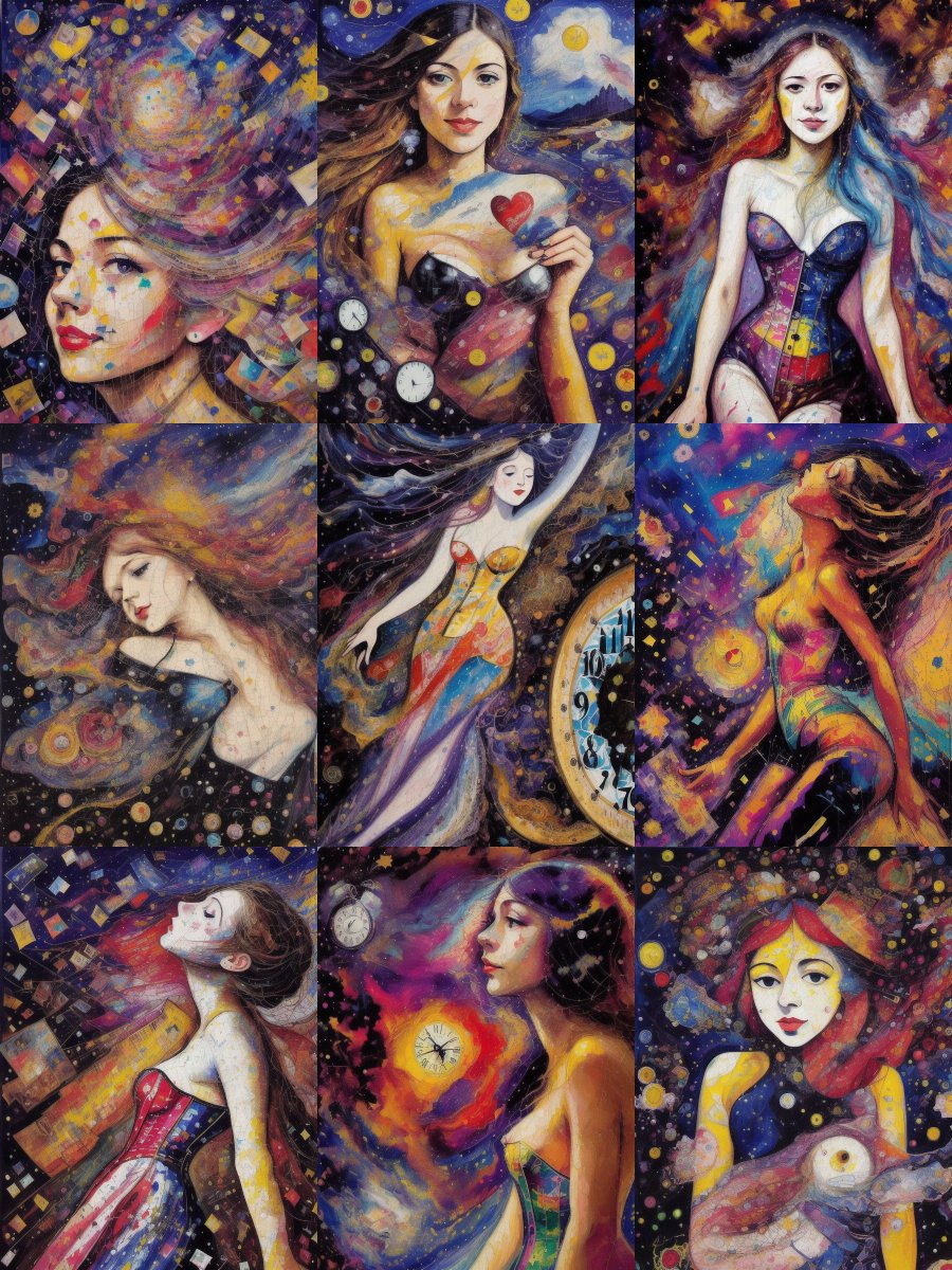
On 5.5 we start to hit finished piece territory. I'm going to publish #5 and #6. One thing I love about Inkpunk is that when I ask for paint splatter, it gives me paint splatter
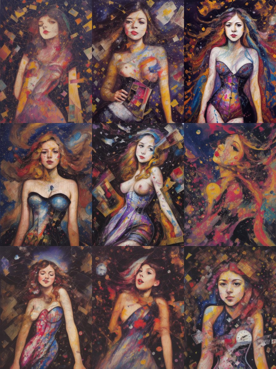
On 0.4, nearly all of these would work as a final product, but #5 is again my favorite. So let's close with that one
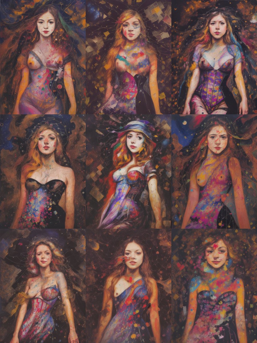
From source to finished piece
Our experiment started easy, went to some interesting places, and ended pretty strong, I think. Starting with this magazine cover I sketched the text off, through the noise paint, into the final product. It's not as weird as I usually like, but it's not bad
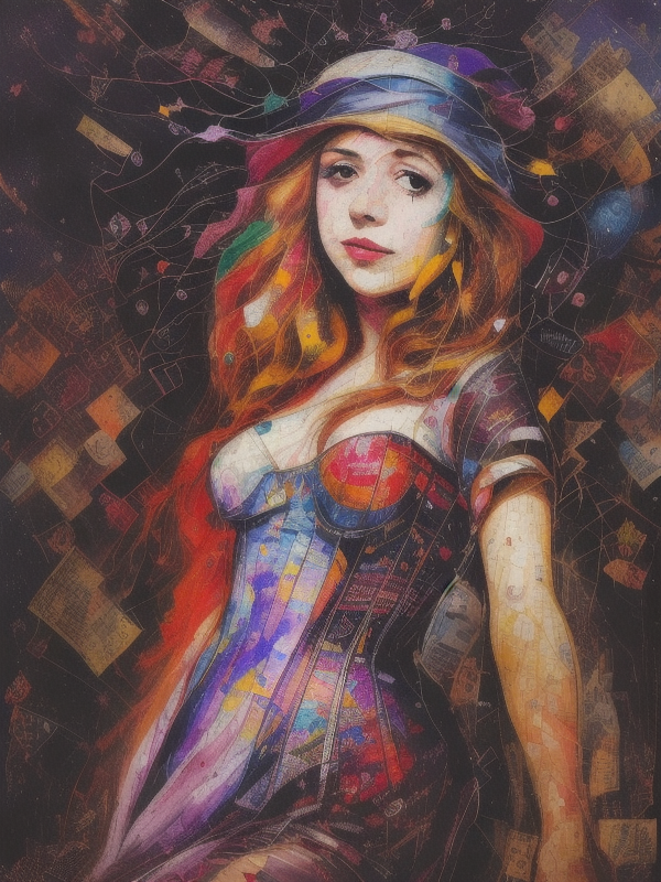
Prompt and checkpoints
Now for details:
Find the final version of my prompt and fine details on Pastebin https://pastebin.com/r8cVyzwg
Checkpoints:
Modern Art Style: https://civitai.com/models/3519/modernartstyle
Pulp Art Diffusion:
https://civitai.com/models/1462/pulp-art-diffusion
And I think that's it babies. I love you all, you're beautiful. You inspire me. I hope this little walkthrough was useful. And if you're new here, I do this kind of stuff all the time, so welcome